6 min read · September 16, 2026
What restoring an archive scan actually involves
An archive scan is a document, not a picture. Turning one into something worth hanging means removing what the last two hundred years did to the paper without removing anything the printer put there.
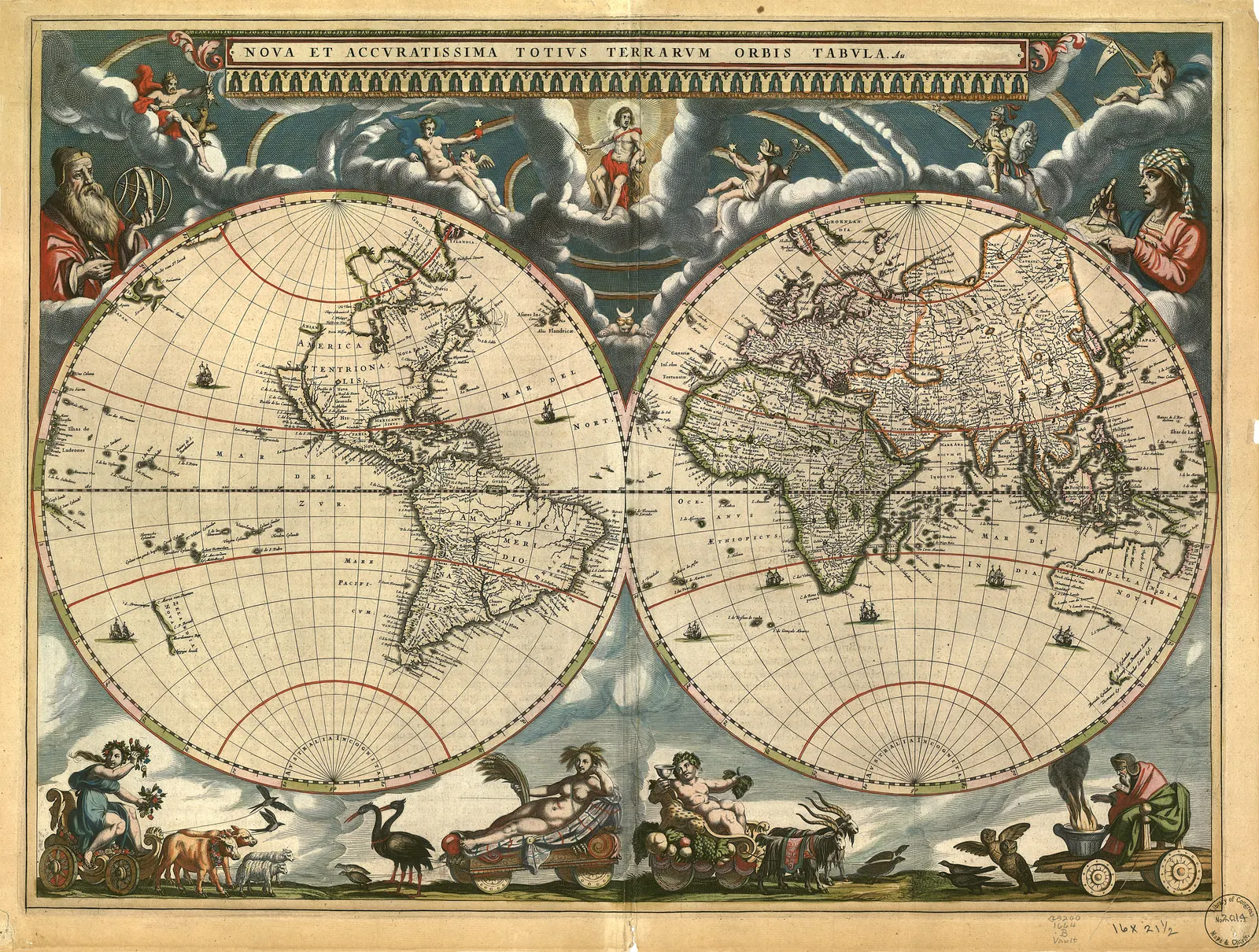
A library scans a map to preserve the object. We print it to hang on a wall. Those are different goals, and the gap between them is the work.
An archive master is usually a very large, very flat, very honest file: the sheet photographed under even light with a colour target beside it, no adjustments, every stain and fold recorded because a researcher might need them. It is a document. Printed as-is at 24 inches, it looks like what it is — a photograph of an old piece of paper in a library.
What comes off
The principle we work to: remove what time and handling did, leave everything the printer did.
Off:
- Fold lines. Most large sheets were folded into atlases or cases. The creases show as pale bands and sometimes as cracked ink. The bands go; where the ink has actually gone, the gap is filled from the surrounding line only if the line’s direction is unambiguous.
- Tape shadows and repairs. Nineteenth and twentieth-century conservation used tape. It yellows and leaves a hard-edged rectangle.
- Foxing. The rust-brown spotting from iron impurities and damp. Hundreds of small marks, and the most tedious part of the job.
- Scanner cast. A colour bias across the sheet from the lighting rig, usually green or magenta, invisible on screen at thumbnail size and glaring at print size.
- The furniture of the scan — colour targets, rulers, the library’s own reference marks, the edge of the table.
What stays
- Paper tone. Old paper is warm. Bleaching it to white is the commonest and worst mistake in this field: it makes a 1664 engraving look like a 2020 poster, and it destroys the contrast relationship the engraver was working with.
- Plate wear and ink density. If the impression is late and the lines are soft, they stay soft. That is what this sheet is.
- Registration. Where colour was applied in a second pass and sits slightly off, it stays off.
- Hand colouring, as applied. Much early map colour was added by hand after printing, unevenly, by a colourist working fast. Evening it out is inventing a sheet that never existed.
- The engraver’s mistakes. Misspelled place names, a river that goes nowhere, a coastline drawn from a bad report. These are the most interesting things on many sheets.
Where it gets genuinely difficult
Telling foxing from stipple. Engravers built tone with dots. A field of fine dots is the artist; a field of brown blotches is damp. At 100% zoom on an 8,000-pixel scan they can look similar, and an automatic despeckle removes both. This is why the passes are supervised rather than batched.
Telling hand colour from staining. A wash of pale green over a province is a colourist. A wash of pale brown across a corner is water damage. Sometimes they overlap.
Knowing when to stop. The strongest temptation is to keep going — to close every gap, even the tone, sharpen until the lines snap. The result looks impressive on screen and wrong on a wall, because it no longer resembles a printed object.
We publish a before-and-after slider on every product page for exactly this reason. It is the only way to show what changed, and it means the claim is checkable rather than asserted.
Resolution sets the ceiling, and it is not negotiable
At 200 dpi — a sensible floor for a print viewed from more than a foot away — a 24-inch print needs 4,800 pixels on that edge. A 48-inch print needs 9,600.
Some archive scans are enormous. Some are 1,500 pixels. No amount of processing adds detail that was never captured, and upscaling a small scan produces smooth, plausible, invented linework — the worst possible outcome on a map, where the fine lines carry the information.
This is why our size range stops where it does. Of 151 restored sheets, 88 support 30 × 40 inches at print-worthy resolution, 58 support 32 × 48, and not one supports 40 × 60. Competitors who sell 60-inch prints of antique maps are either working from originals we have not found or upscaling. We would rather show a shorter size list than sell a soft print.
And the part we will not do
We do not describe any of this as an antique. Every product page names the archive, the year of the original, and what the restoration changed. You are buying a new print of a specific surviving sheet, made as well as the source file allows — which is a good thing to own and a bad thing to lie about.
If you want to see the method rather than read about it, the how we restore page has the full sequence, and the Blaeu world map is the best single example: a 1664 engraving whose original scan carries every fold of three and a half centuries.
Sources
Where this came from
- Library of Congress — digital collections and rights
- NOAA Historical Map & Chart Collection
- Rijksmuseum — Rijksstudio open data
Corrections are welcome and we publish them — info@antiquemapprints.com. Nothing here is generated from a template; if something is wrong it is our mistake, not a machine's.


